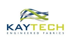
After 10 years Kaytech has given its logo a facelift, ensuring it remains modern and in sync with the company’s key values.
By keeping the corporate colours constant and the key graphic image in place, it is as recognisable as it ever was, yet clearly in tune with the times, says Kaytech. The new logo is inspired by the manufacture of engineered fabrics. Symbolising the intermingling configuration of fibers and geosynthetic components, it illustrates the various proesses of manufacturing needle punched and warpknit geotextiles and geocomposites.The new-look free-flow image with 3D effects also signifies the relationship between the manufacture of polyester geotextiles, from recycled PET bottles, and the environment, which is ultimately enhanced by the efficacy of Kaytech’s products. “People, Planet, Progress” as Kaytech’s slogan, corresponds with these ideas as they all combine to enrich humankind by sustaining life on the planet and its progression.
The elements of land, water and air are brought in through the green, blue and white colour scheme, which also suggests transparency, honesty and integrity. The white stripe is significant, highlighting Kaytech’s mission statement.

